




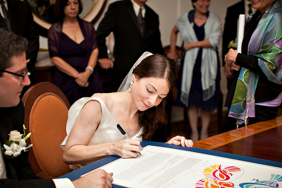
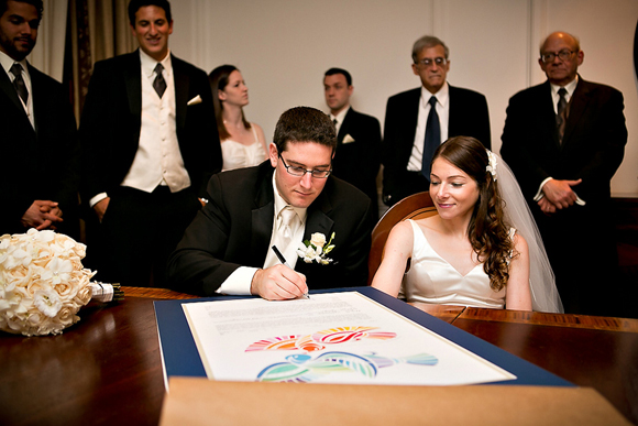
Has this happened to you? You find a ketubah that you both agree on, the wording meets your marriage ideals, the price is right, you know exactly where you want to hang it and… oh wait. The colors don’t match the room.
Womp womp womp.
Buzzkill ketubahs are everywhere. And it’s no surprise. With ketubah art being such a personal thing, it’s not a shocker that your choices are narrow when you look at all the specs. So many ketubah shops and independent artists offer a wide variety of ketubah pieces, but once you consider the style of art, your choices get smaller. Then your price range. Slimmer options. Then your ability to customize your text or not. Narrow. And what you’re left with is a handful of “well, we don’t hate ’em” ketubah possibilities. And of those, what if the colors are not your cup of tea?
More and more ketubah art is becoming customizable and I think that’s great. Here’s something so personal and so unique to a couple’s marriage, they should have the ability to be tailored for the newlyweds.
I’m currently loving New World Ketubah by Rachel Deitsch‘s custom concept that stays true to her own artistic style, while accommodating her couples’ wall paint or furniture. Or, even, just taste.
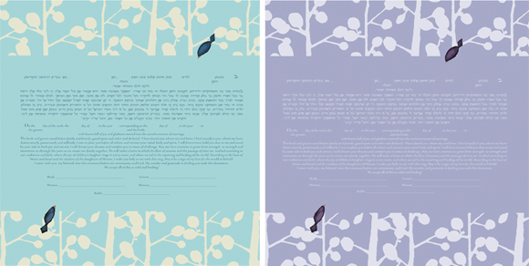
The piece itself is called “Branches” and it’s the perfect blend of modern and traditional. With clean and simple detail, and without blatant Jewish symbols or landscapes, this ketubah could fit the style range of an interfaith couple to a super traditional couple.
Consequently, the simplicity lends itself to all kinds of color combinations so the couple can really direct the mood of the artwork. When it comes to choosing a color, deciding what sort of “mood” you’d like to express should come first. Do you want to reflect the season the wedding takes place, for instance, or a time of year that is special to you as a couple?
The best bet for color-matching would be getting the PMS Process Color (CMYK) formula from your invitation printer if you are trying to match the invitations. Be aware that color can shift from printer to printer and even from paper to paper, but Pantone colors are the best way to get your closest match. You can also send a paint chip, matte finish. Once the two color formulas are in place, Rachel will email you an image before printing.
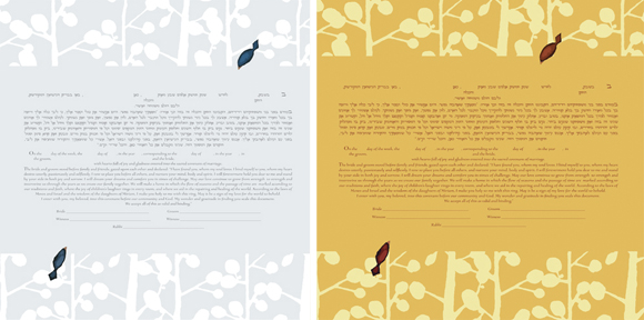
There are a lot of ways to play with this, so be open minded! For example, Rachel personally likes a seasonal reference, so her initial collection of four color themes are nods to winter (gray and a pop of red), summer (sky blue) spring (lavender) and fall (orangey yellow). The best part is that there’s no wrong answer and the fun is seeing what couples can come up with!
Unlike other custom ketubah collaborations, Rachel’s is currently no extra cost. It’s just the price of the ketubah. Save your gelt for Chanukah, friends!
Oh, and P.S., Rachel also creates invitations! The fun just never ends!
Follow New World Ketubah on Facebook to keep up with the news and updates!























Pingback: New ketubah design with custom color option | New World Ketubah | Custom Ketubahs | Ketubah Designs | Modern Ketubah